Turn Your Colors Into Show-Stopping Prints
Color-perfect artwork is the secret behind full-color DTF transfers that really pop. Great prints do not start at the press; they start on your screen. When the artwork file is clean, sharp, and planned for print, your shirts, jerseys, and merch can look bold and professional instead of dull or dusty.
Right now is prime time for spring and early summer launches. Think team uniforms splashed in school pride, spirit wear that shouts from the stands, camp tees, vacation merch, family reunion shirts, and festival drops that glow in a crowd. All of those depend on color that reads clearly and stays strong from one wash to the next. Get your artwork right now, and you set the tone and the vibe for the whole season.
At Florida DTF Factory, we run high-end printers, inks, and films, but the final look always comes back to the files we receive. Great files mean great color. In this guide, we are breaking down how to prep artwork so your next gang sheet order prints the way you pictured it in your head, or even better, turning your ideas into wearable color fireworks.
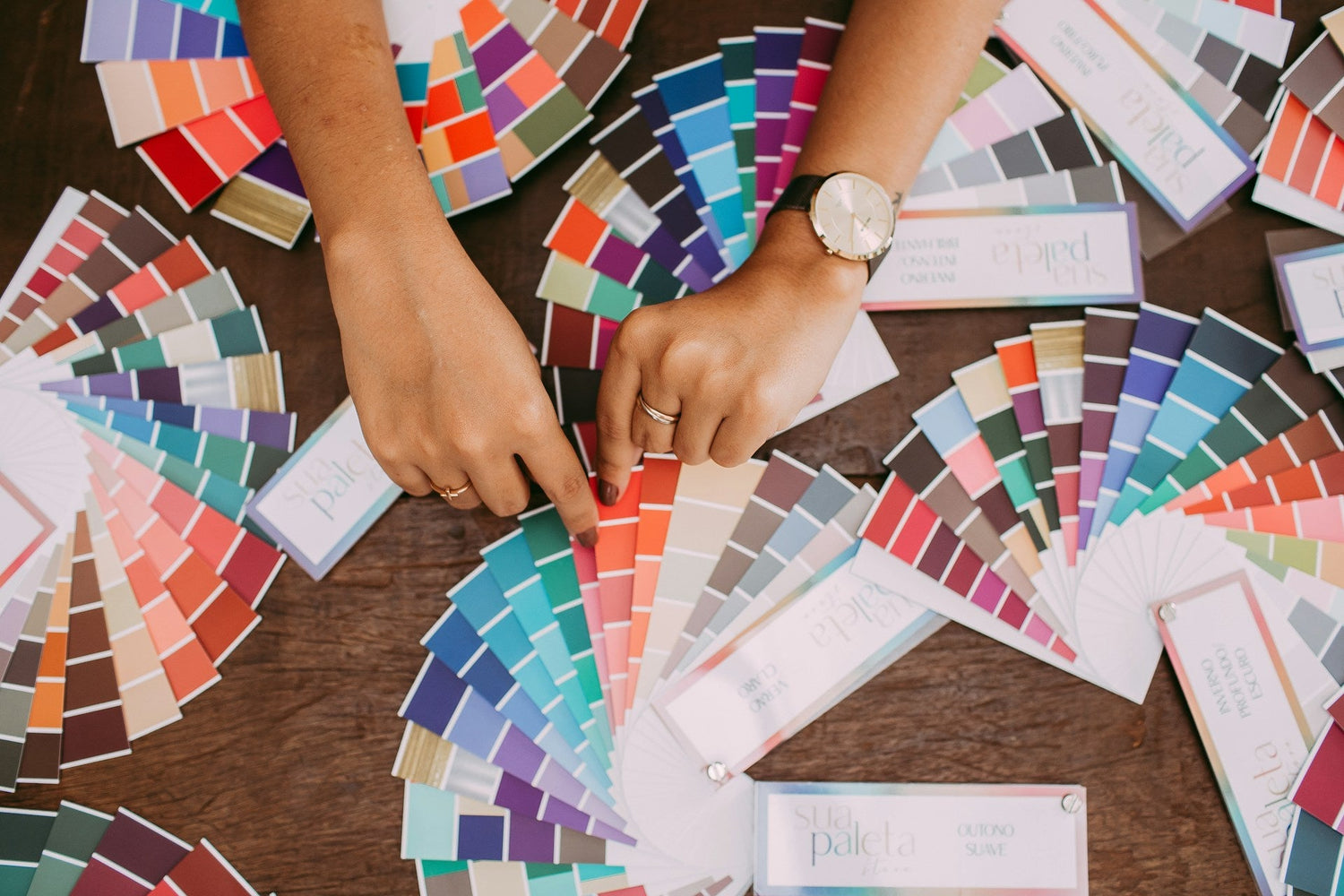
Color Magic 101: Build a Palette That Actually Prints
Screens use RGB light, printers use CMYK ink. On a backlit screen, colors can glow in a way that ink cannot copy perfectly. That is normal. The trick is to plan colors that still look strong and lively once they are on a shirt instead of a bright display.
Smart color choices start here:
- Skip ultra-neon shades that look like highlighters on screen; they are screen-only superheroes that fade in the real world.
- Be careful with super dark-on-dark, like navy text on black or maroon on brown. Those combos can turn into midnight mud.
-
Avoid very low-contrast pairs, like pale gray on white, that disappear in real life.
Aim for a simple, repeatable brand palette so your full-color DTF transfers stay consistent from run to run. Think of it as your signature color recipe:
- 3 to 5 main colors you use often
- 1 or 2 accent colors for extra pop, highlights, or surprises
- Neutral support colors like white, black, or a single gray to balance the brights
Skin tones and gradients need extra attention. Keep gradients smooth and not too subtle. If the shift from light to dark is barely visible on screen, it may look flat when printed. For shading and shadows, slightly stronger contrast usually works better so shapes still have depth once pressed on fabric and your artwork does not lose its dimension.
If you are building a new brand palette or using tricky colors like pastels, dark purples, or detailed skin tones, it can help to order a small test. Adding a color test panel to a gang sheet is a smart way to see how your favorite shades behave when they hit the press, like a mini color dress rehearsal before the big show.
File Setup Secrets for Crisp, Clean Transfers
Good color is wasted if the file itself is blurry or messy. File prep is where sharp lines, clean edges, and pro-level results start, and where your artwork turns from "nice idea" into "print-ready rockstar."
For resolution and file types:
- Design at 300 DPI at the exact size you want printed.
- For tiny details or very thin text, 600 DPI gives extra safety and keeps the small stuff sharp.
- PNG files with transparent backgrounds are great for most full-color DTF transfers.
- High-quality PDFs or vector files from AI or EPS work well for logos and flat graphics.
Plan your design at final print size instead of scaling at the last second. That means if your chest print will be 10 inches wide, build it at 10 inches wide at 300 DPI. Also think about safe zones: keep key text, logos, and small details away from the very outer edge of the design. A little breathing room makes it easier to fit everything neatly on gang sheets and keeps your layout from feeling cramped.
Backgrounds and transparency are big for DTF:
- Use a transparent background when you want the shirt color to show around and inside the design for a cut-out, custom feel.
- Use a solid or shaped background if you have very complex edges, distressed textures, or photo-style art. This can keep the print clean, bold, and easier to press.
- Turn off hidden layers before saving, clean up stray pixels, and zoom in to catch any light halos that could print as odd outlines instead of clean edges.
When files are clear, sized right, and set up with the correct background, they move through a production system faster with fewer questions or edits. That means smoother orders, fewer surprises, and a final print that looks as sharp and colorful as you imagined.
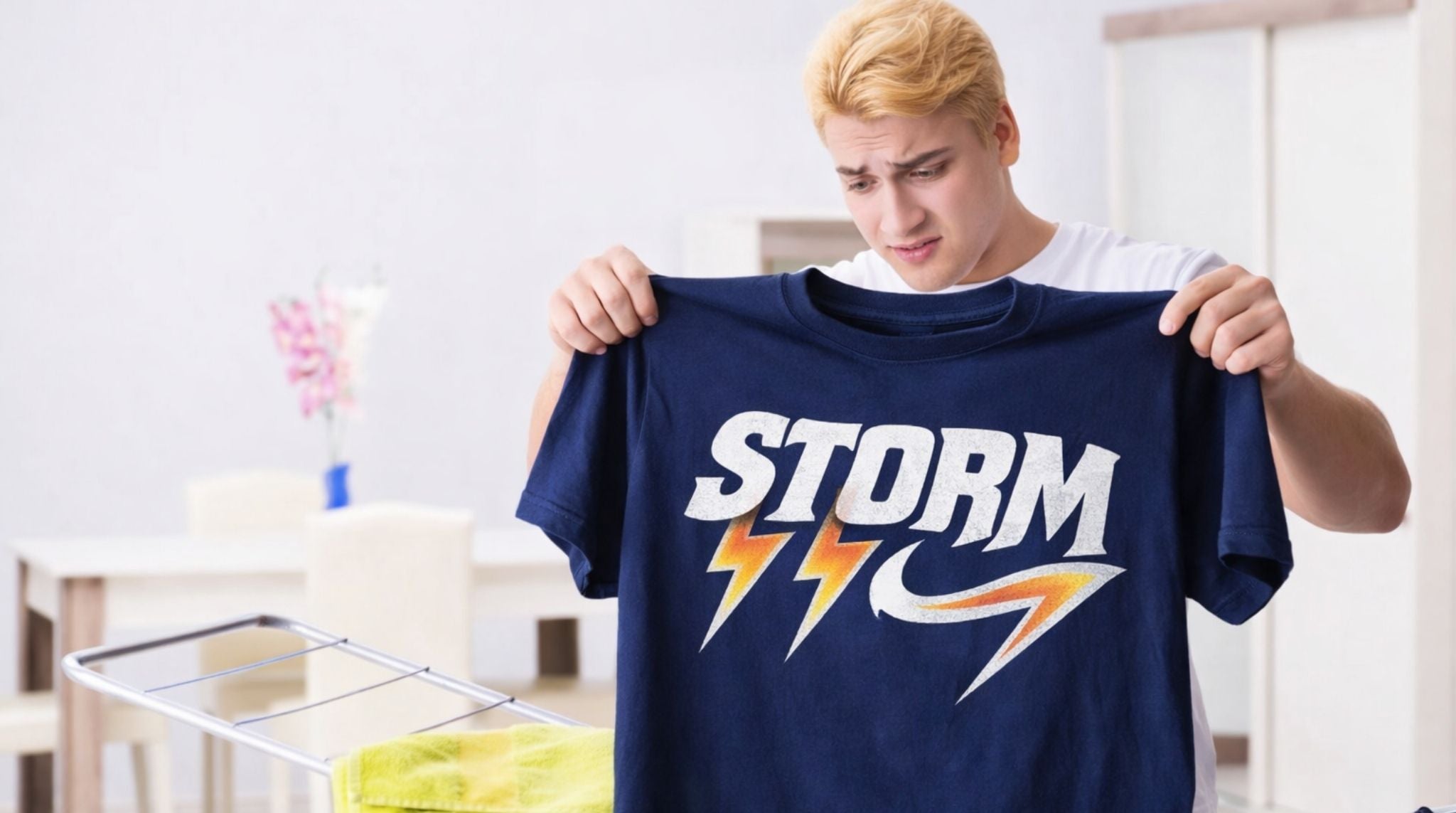
Line Work, Details, and Text That Survive the Heat Press
DTF can hold a lot of detail, but there is still a limit to how tiny you can go and still get clean results. Super thin lines and micro text that look cool on screen can break down or close up once pressed, turning crisp designs into fuzzy smudges.
Helpful rules of thumb:
- Avoid hairline strokes; make key lines a bit thicker than you think you need.
- Keep very small text bold and simple so it stays punchy and legible.
- Thicken outlines on small logos or icons so they stay clear under heat and pressure.
Font choice matters, especially for team names, spirit wear, and event shirts for spring and summer. Clean, bold fonts are your friend when you want cheering-section visibility:
- Use simple sans-serif or block fonts for names and numbers.
- Save delicate scripts for larger text where they can breathe and show off their curves.
- Avoid super-condensed fonts for tiny print; they can turn into a blur instead of a statement.
Edge control is another big one. Designs full of tiny floating bits, wispy flourishes, or super jagged edges are more likely to peel or crack over time. Solid shapes and smart knockouts help a lot. For example, instead of printing white ink inside small letters on a dark block, you can knock out those letter shapes so the shirt color fills them. That keeps the print smoother, more durable, and easier to press while still looking bold.
People who run print-and-press setups see the same avoidable issues over and over: lines too thin, fonts too tiny, stray pixels around edges. When you follow these basic rules, your designs hold up better on every press and across a whole season of wear, keeping your colors loud and your details clear.
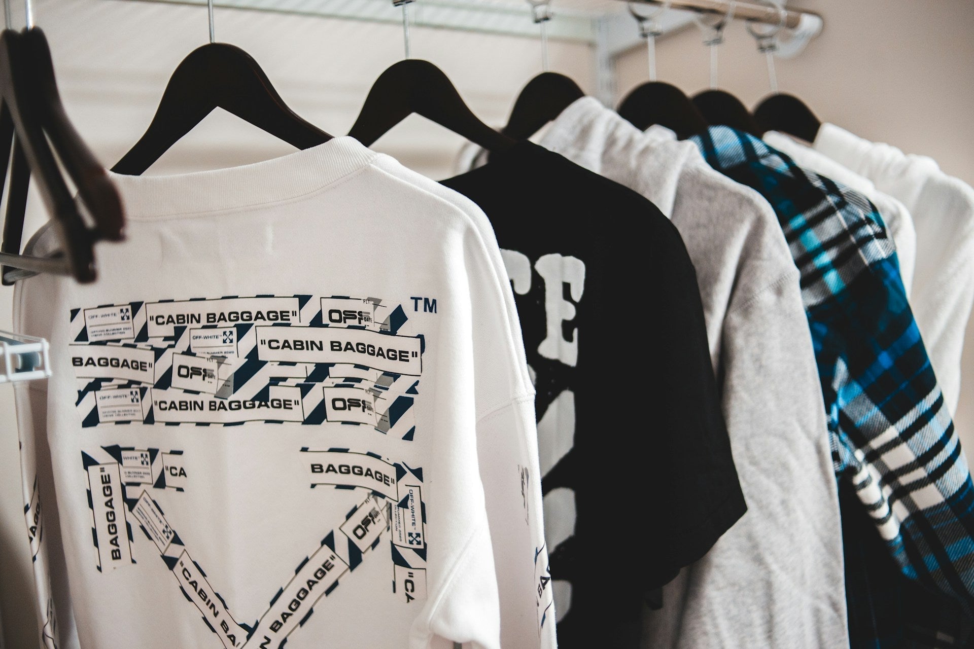
Color-Perfect Prep for DTF Gang Sheets
Gang sheets are all about planning. You are not just dropping random designs onto a big sheet; you are building a mini collection that should work together like a coordinated outfit.
Start by grouping designs by how you will use them:
- Main front prints and back prints
- Player names and numbers
- Sponsor logos and patches
- Neck labels, sleeve hits, and pocket logos
This helps you think through color, size, and shirt type at the same time. Mix large hero designs with smaller add-ons to squeeze the most value out of each sheet and create sets that feel intentional instead of thrown together.
Matching artwork to shirt colors is huge with full-color DTF transfers. Before you design, decide where each piece will go:
- Use lighter designs with strong outlines on dark shirts so they stand out from across the room.
- Use rich, deeper colors on light shirts so they do not look washed out.
- Add a stroke or shadow if your art risks blending into the garment color. A simple outline can turn a quiet design into a loud one.
DTF uses white ink as an underbase for bright colors on dark garments. Anywhere you expect solid, bright color on a dark shirt needs a good, clear shape so the white underbase can do its job. Fuzzy edges and unclear shapes can lead to uneven color and weak edges, while bold shapes keep your prints looking strong and confident.
When gang sheets are built with color intensity, solid shapes, and clean layouts in mind, you get transfers that press fast, look strong, and handle busy seasons without stress, perfect for back-to-back games, camps, festivals, and pop-up drops.
Press-Ready and Color-Confident
Before you upload art for full-color DTF transfers, run through a quick checklist:
- Are your colors set with realistic expectations for print, not just screen glow?
- Is every file 300 DPI at final size, or higher for tiny details?
- Did you choose transparent or solid backgrounds on purpose, not by accident?
- Is all text big enough and readable from a normal distance?
- Is your gang sheet layout planned so nothing important sits on the edge?
Finish with a last on-screen review at 100 percent zoom. Look for jagged lines, random dots, halos, and typos. Catching small issues here can save a lot of time and stress later, and keeps your final prints looking polished rather than rushed.
When your files are prepped with clear color choices, solid line work, and smart gang sheet layouts, you can move confidently from screen to shirt. That is when full-color DTF transfers stop feeling tricky and start feeling like a reliable, colorful part of every spring and summer drop, turning every order into a little collection of show-stopping prints.
Get High-Impact Prints In Less Time
If you are ready to simplify your production while leveling up your prints, our full-color DTF transfers make it easy to turn your artwork into durable, vibrant designs on almost any fabric. At Florida DTF Factory, we handle the printing so you can stay focused on growing your apparel brand or custom merch business. Start your next project today by uploading your designs, or contact us with any questions before you order.
Leave a comment
This site is protected by hCaptcha and the hCaptcha Privacy Policy and Terms of Service apply.